Headversity
Modernizing the industry-leading workplace mental health app for desktop and mobile.
The Challenge
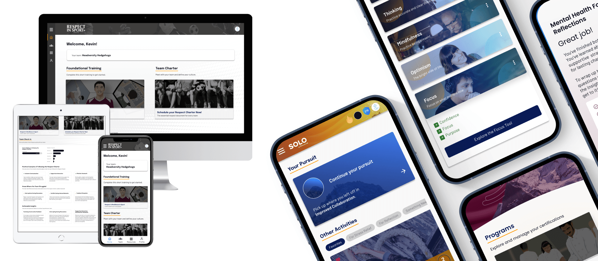
When I joined Headversity, the platform had grown rapidly during the 2020 pandemic. Early design decisions prioritized speed over scalability, and while the mobile app worked, the platform lacked a cohesive web experience, consistent design system, and streamlined user flows.
The Challenges:
- Modernize the app for mobile, desktop, and web.
- Improve usability, engagement, and retention.
- Maintain a focus on data collection and actionable insights for admins.
- Ensure accessibility (AA rating minimum) and future scalability.
The Role
I led UX/UI design for this full platform revamp, collaborating closely with Product, Marketing, and Engineering.
- UX/UI Design: Wireframes, prototypes, final UI for mobile and web.
- User Research & Testing: Interviews, surveys, and usability sessions with a diverse set of users.
- Cross-Functional Facilitation: Workshops with Product, Engineering, Marketing, and Customer Success.
- Iteration: Continuous refinement informed by user feedback and business goals.
The Personas & User Research
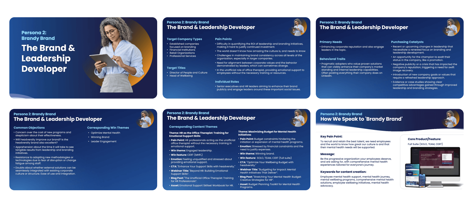
We started by building updated user personas through remote interviews, focusing on target audience motivations, values, and daily routines.
- 7 users were interviewed over 4 days, spanning multiple industries and job types.
- Insights informed feature prioritization, user flow improvements, and marketing messaging.
- One persona, for example, the “The Brand & Leadership Developer,” highlighted the importance of inclusive, actionable mental health content.
The Surveys
We complemented interviews with a broad survey, reaching 100 employees across 10 clients.
- Many differences in workplace mental health perception between blue and white-collar employees.
- The feedback informed both Product and Marketing teams on how to position and deliver features effectively.
We discovered industry-specific patterns and highlighted areas where design could make a tangible difference, such as customizing onboarding flows for different user groups.

The User Journey
Onboarding was a critical area for improvement:
- We needed quick, seamless flows that communicated value and benefits to users.
- We incorporated stakeholder requirements while balancing usability - Data points are too valuable in onboarding to ignore for anything.
The Wireframes
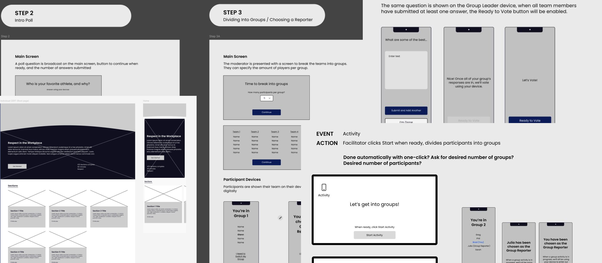
Wireframes were created in Figma and Miro:
- Low-fidelity for early alignment with stakeholders.
- High-fidelity for features requiring more detailed design or testing.
- We collaborated with Engineering to ensure technical feasibility of web and mobile implementations.
Research-informed decisions meant only one round of revisions was needed for low-fidelity wireframes.
The Testing Groups
We created high-fidelity prototypes for internal and external testing:
- Three rounds with five users each.
- Users responded positively to streamlined navigation and clearer content delivery.
- Minor confusion in onboarding and stakeholder-mandated elements required iterative adjustments.
Cross-functional impact:
- Product: Prioritized features and roadmap adjustments.
- Marketing: Refined onboarding messaging and in-app prompts.
- Engineering: Optimized responsive web flows and mobile-first interactions.

The UI
Our results:
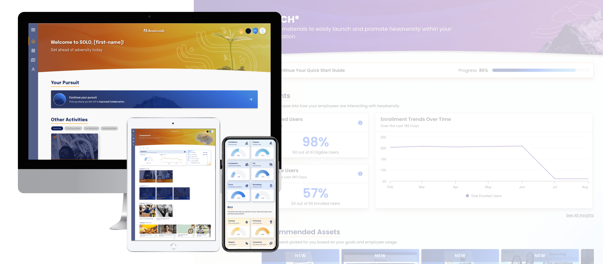
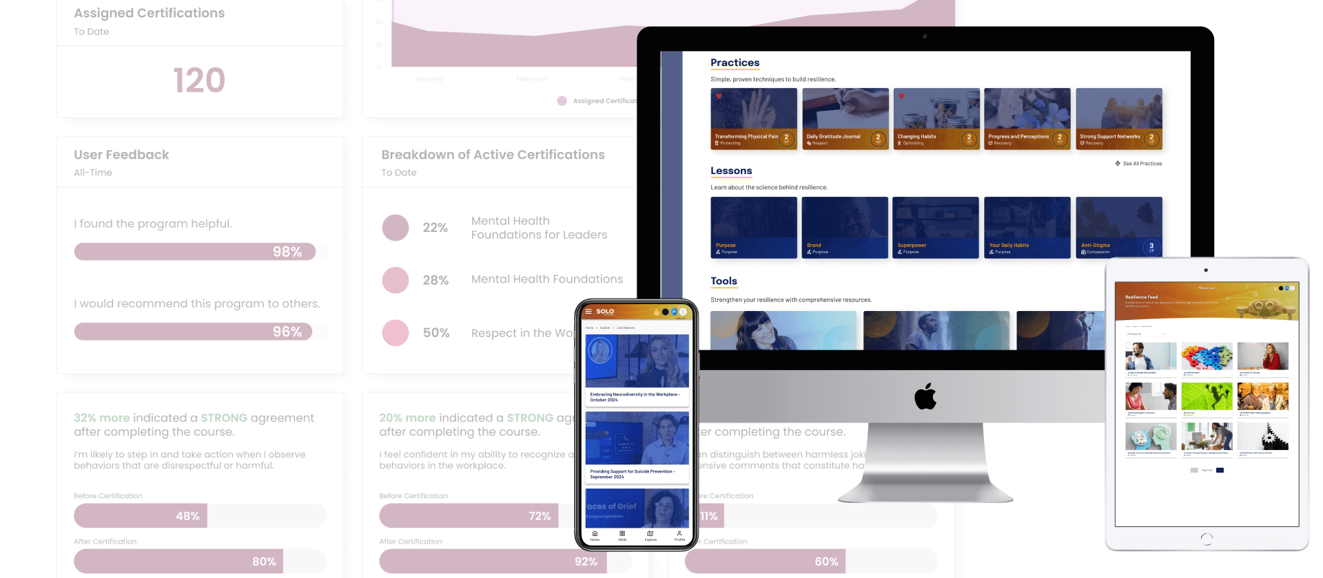
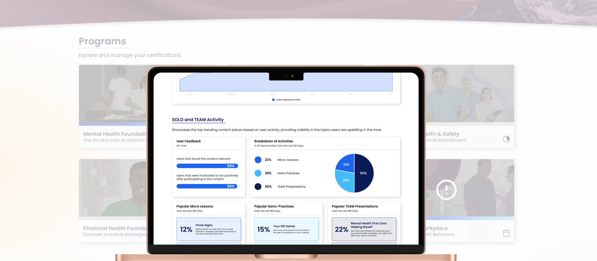
- A responsive, mobile-friendly platform that works seamlessly on desktop and mobile.
- A consistent design system improving usability, accessibility, and visual cohesion.
- Clearer user flows and data collection points that support insights-driven decision-making for clients.


The Outcome
The platform revamp delivered measurable impact:
- Engagement: Increased retention as users returned regularly to complete exercises.
- Revenue: Enabled scalable onboarding for new clients, contributing to overall sales growth.
- Cross-functional Success: Marketing leveraged insights for campaigns, Product aligned roadmap with research, and Engineering efficiently implemented responsive web and mobile design.
- Accessibility: Achieved AA-level compliance, making mental health content more accessible to all employees.
What I Learned
- Cross-functional collaboration is key: Designing a platform that satisfies users, stakeholders, and technical constraints requires tight coordination between teams.
- Mobile-first thinking matters: Optimizing for mobile early ensures web implementation is cohesive and scalable.
- User research informs everything: Surveys, interviews, and testing highlighted differences across industries and informed both design and messaging strategies.
- Iteration never stops: Real-world feedback drove refinements that improved adoption, engagement, and long-term satisfaction.